Why a plain photo is easy to scroll past
Instagram is a feed of photos. A person moves through it fast, with one thumb, and stops only when something tells them it is worth a look. A plain photo of a beach, a bike or a shop counter tells them very little. It does not say what the post is about, or why they should care. The answer is in the caption under the photo, and a person who did not stop never reads it.
A wide photo has a second problem. Instagram shows it at the full width of the phone, so it is short, and it fills only a strip of the screen. The next post is already in view under it.
So we stopped posting the plain photo. Every article image is now drawn again as a vertical Instagram image, and that is the image we post.
What is on the vertical image
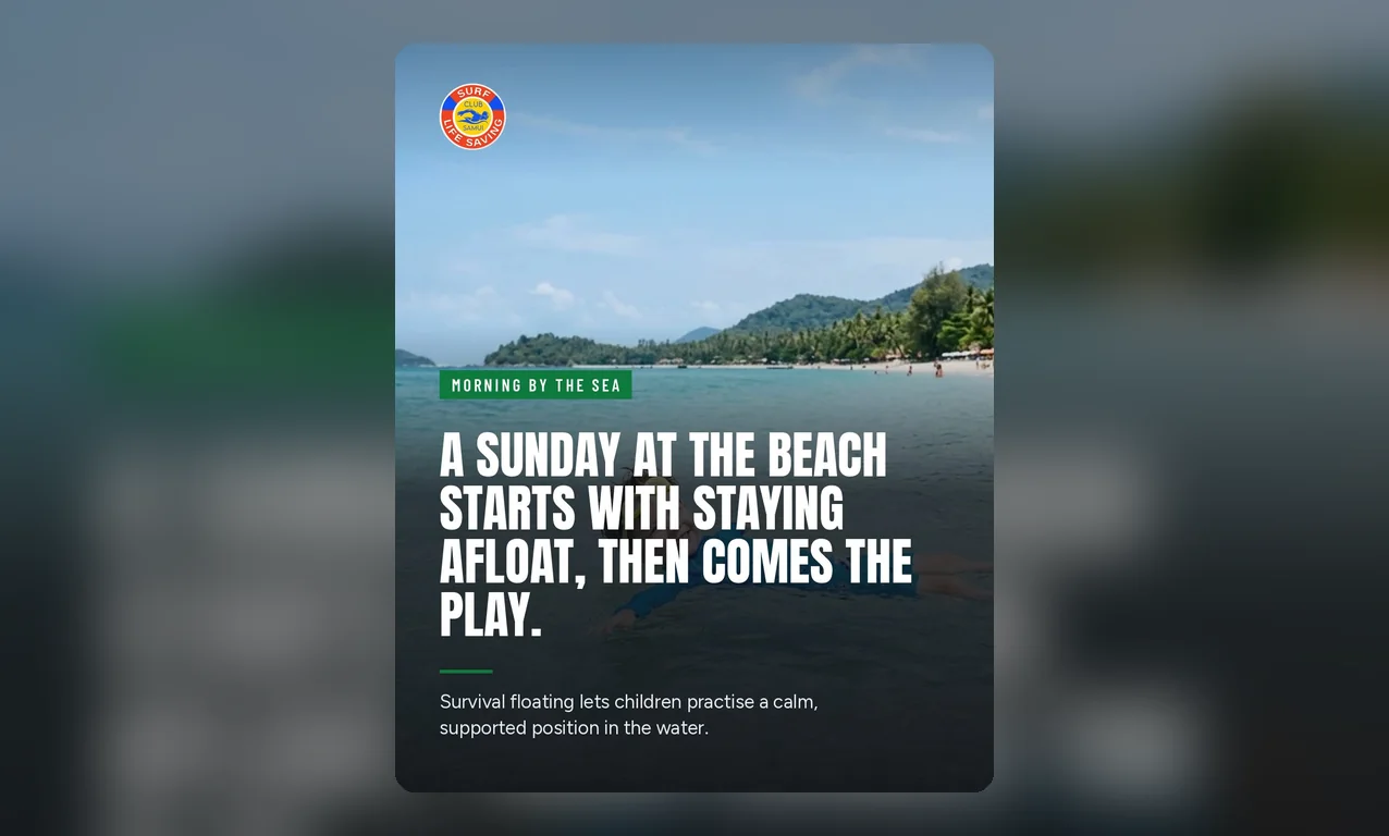
The vertical image is 4 by 5: taller than it is wide. It takes the full width of the phone and much more of its height than a wide photo does. On it we lay four things, all taken from the article it was made from:
- The topic. A short label, such as Morning by the sea, that says what the article is about. A reader sees at once whether it is a subject they care about.
- The key point. The large words are the article's first key point. It is the most useful sentence in the article, so the post teaches the reader something even if they never open the link.
- One more sentence. Smaller words under it: the first sentence of the article's overview, which says what the article covers.
- Your logo. In a corner, on every post, so people learn to know your business by it.
The words are cut from the article itself. Nothing new is written for the image, so the post never promises something the article does not say. When a sentence is too long for the design, we remove whole words from its end until it fits. A word is never cut in half, and when the smaller sentence still does not fit, we leave it off and keep the rest.
Why this works better than a plain photo
- It says what it is about. The reader does not have to guess from a photo or open the caption. The topic and the key point are in front of them.
- It lets the right people stop. The topic label tells a reader in one look if the article is for them. A person who wants to know about the subject stops; a person who does not moves on, and you lose nothing.
- It gives something before it asks for anything. The key point is useful on its own. A post that teaches something is a post people remember and come back to.
- It fills the screen. A tall image takes more of the phone than a wide one, so it is in view for longer as the reader scrolls.
- It looks like one business. Every post carries the same design and your logo, so your profile looks planned, not like a set of random photos.
- You do nothing. The vertical image is made by itself, right after the article image, from words that are already there.
We have not yet measured the effect on likes, follows or visits. The reason for the change is simple: a post that says what it is about gives the right reader a reason to stop.
Five designs to choose from
At first every website used one design. Now there are five, and you choose the one that fits your business:
- Coastal, the one every website starts with: the words at the top on a dark fade, the label on a painted stroke.
- Bottom line: tall capitals at the bottom, the photo clear above them.
- Editorial: the photo on top, the words on white under it, like a page from a magazine.
- Centre stage: every word in the centre, on a darker photo.
- Postcard: the photo in a card on a deep colour, the words under it.
Each design uses the same photo, the same words and the same logo. Only the layout changes. You can see all five under this article, made from one photo, so you can compare them side by side.
How to choose a design
Open your website in the panel and go to Settings. The part called Instagram template shows the five designs as cards, with a sample of each. Press a sample to open all five full screen, side by side, and move left and right to compare them. To choose one, press the tick beside its name. The panel asks you to confirm, and when you press OK, the design is saved. Each website has its own design, so your other websites keep theirs.
What happens to images you already have
When you change the design, we draw the Instagram image of every article not yet posted to Instagram again, in the new design. You do not have to wait for next month's articles to see it. An article that is already on Instagram keeps the image it was posted with, so your profile does not change under your followers.
You can see the Instagram image of any article in the panel, on the article's page, beside its photo.
One limit today
The five designs draw Latin letters only. An article written in Thai, Chinese or Russian does not get a vertical image yet. Articles in English, French, German, Spanish, Portuguese and Italian all get one.